

NEWPUBLIC
A school website rebuilt around what parents actually search for, full UX and UI, on-page SEO architecture, and every word of the content written from scratch.
Role
UX Designer · SEO · Content Writer
Client
New Public College
Scope
Website · On-page SEO · Copy
Status
Live
Parents don't browse. They search.
The school had a presence, not a website. Admission information lived in PDFs, the academic story lived in a brochure, and none of it was findable when a parent typed a question into Google at 11pm.
I took the project end-to-end: information architecture, UX and UI design, the on-page SEO structure, and the content itself. Every heading, page title, meta description and body paragraph on the live site is copy I wrote.
A school website is a search product before it is a brand product. It has to be beautiful and it has to be findable, the two constraints fight each other, and resolving that fight was the actual work.
What a parent asks before they call.
I started with search behaviour, not sitemaps. Parents arrive with a shortlist of anxieties: is admission still open, what does the day look like, how far is it, who teaches my child, what will this cost me in time. Those anxieties are literally typed into a search bar, so they became the page structure.
"I found three schools on Google and picked the two whose fee and admission pages I could actually read."
Parent, admission-stage
"If I have to download a PDF to know when the school year starts, I've already moved on."
Parent, research-stage
"Every page should answer one question and point to the next one."
My own working rule
One question per page. One clear next step.
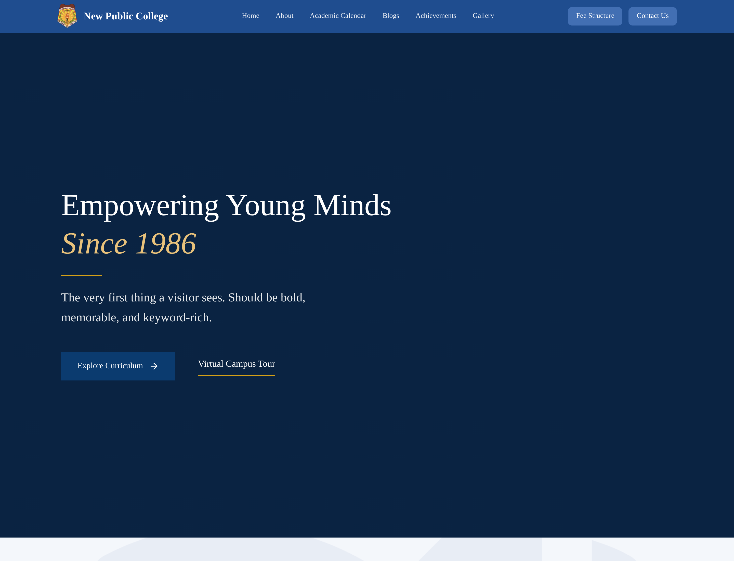
The homepage carries three jobs: say who the school is, prove it, and route the parent to admissions. Everything else, academics, facilities, faculty, news, sits one level down where it can be written at length for both readers and crawlers.
Mobile was the primary canvas. The majority of parent traffic to school sites is phone traffic, arriving from search, often late at night. Every layout decision was made on a 390px frame first and widened afterwards.


Search-led sitemap
Home, brand + admission routing
├── Admissions, process, dates, eligibility, enquiry form
├── Academics, curriculum, streams, assessment
│    └── Beyond Academics, sports, arts, activities
├── Faculty, teaching philosophy and staff
├── Facilities, campus, labs, library, transport
├── About, history, leadership, vision
└── Contact, location, phone, directions, map
Each node owns one intent cluster, so no two pages compete for the same query.
Structure first. Then sentences.
SEO on a small site is not a trick, it is discipline. One primary intent per page, one H1, descriptive titles under 60 characters, meta descriptions written as invitations rather than summaries, semantic headings that mirror how a parent would ask the question, image alt text that describes the actual campus, internal links that always lead toward admissions.
Page → intent → keyword → CTA
| Page | Search intent | Primary phrase family | Next step |
|---|---|---|---|
| Home | Is this school right for us? | school name · school in the city | Admissions |
| Admissions | Can we apply now? | admission · fees enquiry · application process | Enquiry form |
| Academics | What will my child study? | curriculum · streams · CBSE-style academics | Beyond Academics |
| Facilities | Is the campus safe and equipped? | campus · labs · library · transport | Contact |
| Contact | Where is it and who do I call? | address · directions · phone | Enquiry form |
Roughly 4,000 words written across the site, admissions, academics, facilities, faculty, about, from staff interviews, not filler. Reading level deliberately kept plain.
Unique titles and descriptions, single H1 per page, semantic heading order, descriptive alt text, clean URL slugs, mobile-first performance, indexable static content.
Consistent name-address-phone, embedded map and directions, location language written naturally into the copy rather than stuffed into it.
The site is new. I'm reporting the work I did, the architecture, the copy, the technical hygiene, not a ranking claim I can't yet prove. Organic performance is being tracked and will be reported here when there's real data behind it.
Pages designed & written
Words of original copy
Intent per page
Mobile-first
"A school website earns its keep in the search results, not in the design review. This one was designed to survive both."
What this project actually taught me.
SEO is an IA problem
Most 'SEO work' I did here was really information architecture. When each page owns exactly one question, keywords stop being decoration and become structure.
Writing is designing
I couldn't hand the copy to someone else. The layout and the sentences were decided in the same pass, that's why the pages scan.
Plain language wins
The most effective edit on the whole site was removing institutional vocabulary. Parents don't search in brochure language.
Findable beats beautiful
A page nobody reaches is a page that failed. Design and search visibility are one deliverable, not two.
"Design, words, and search are the same craft pointed at three different audiences: the parent, the search engine, and the school."
Outcome
- Website live at newpubliccollege.in with every page written and SEO set up.
- [ADD REAL RESULT]
Need something similar?
This project is part of my website design work.
Explore Website Design services